このモジュールは、ftxui::Elementの階層セットを定義します。要素はレイアウトを管理し、ターミナルの寸法変更に反応できます。このモジュールが多数の演算子を使用してシンプルなレイアウトを作成するために使用される以下の例に注目してください。
Example セクションには、例のコレクションが用意されています。
例:
...
Element document =
vbox({
text(
"The window") | bold |
color(Color::Blue),
text("The footer")
});
document = border(document);
document = document | border.
document |= border
...
}
Element text(std::string_view text)
UTF8エンコードされたユニコードテキストを表示します。
Element color(Color color, Element child)
要素の前景色を設定します。
Element gauge(float progress)
高精細プログレスバーを描画します。
Element vbox(Elements children)
要素を縦に一つずつ表示するコンテナ。
要素の一覧
すべての要素の一覧が含まれており、対応するヘッダーファイルを インクルードすることでアクセスできます:
#ifndef FTXUI_DOM_ELEMENTS_HPP
#define FTXUI_DOM_ELEMENTS_HPP
#include <cstdint>
#include <functional>
#include <memory>
#include <string_view>
class Node;
using Element = std::shared_ptr<Node>;
};
Color unselected_color,
Color selected_color);
Color unselected_color,
Color selected_color);
std::vector<std::string> charset,
Element canvas(
int width,
int height, std::function<
void(Canvas&)>);
}
}
#include "ftxui/dom/take_any_args.hpp"
#endif
#define FTXUI_EXPORT(component)
Element window(Element title, Element content, BorderStyle border=ROUNDED)
要素の周囲にタイトルとボーダーを持つウィンドウを描画します。
Element borderDouble(Element child)
要素の周囲に二重線のボーダーを描画します。
Element focusCursorBarBlinking(Element child)
focus と同じですが、カーソル形状を点滅バーに設定します。
Element xflex(Element)
必要に応じてX軸上で拡大・縮小します。
Element gaugeDirection(float progress, Direction direction)
指定された方向に進行する高精細プログレスバーを描画します。
Decorator focusPositionRelative(float x, float y)
frame内で使用され、ビューを特定の位置にスクロールさせます。位置は要求されたサイズの割合で表されます。
Element separatorStyled(BorderStyle style)
他の2つの要素の間に垂直または水平の区切り線を描画します。
Element xflex_grow(Element)
可能であればX軸上で拡大します。
Element underlinedDouble(Element child)
テキストに二重下線を適用します。
Element clear_under(Element element)
|child|を描画する前に、その下のセルをクリアする。これは dboxとの組み合わせで有用。
Element borderDashed(Element child)
要素の周囲に破線のボーダーを描画します。
Element separatorEmpty()
他の2つの要素の間にEMPTYスタイルで垂直または水平の区切り線を描画します。
Element vscroll_indicator(Element child)
右側に垂直スクロールバーを表示します。 色はコンテンツに従います。
Element nothing(Element element)
何も行わないデコレーションです。
Element paragraphAlignLeft(std::string_view the_text)
段落を複数行にわたって左揃えで描画する要素を返します。
Decorator size(WidthOrHeight direction, Constraint constraint, int value)
要素のサイズに制約を適用する。
Element flex(Element child)
子要素をコンテナに残されたスペースに比例して拡大させます。
Element hyperlink(std::string_view link, Element child)
ウェブブラウザを使用してレンダリングされた領域をクリック可能にします。 ユーザーがクリックするとリンクが開きます。 これは、限られたターミナルエミュレータでのみサポートされています。 リスト: http...
Element gaugeRight(float progress)
左から右へ進行する高精細プログレスバーを描画します。
Element focusCursorUnderlineBlinking(Element child)
focus と同じですが、カーソル形状を点滅下線に設定します。
Element bold(Element child)
より強調したい要素に、太字フォントを使用します。
Element spinner(int charset_index, size_t image_index)
時間やイベントの効果を表現するのに便利です。これはアスキーアートの「ビデオ」を表示します。
Element borderRounded(Element child)
要素の周囲に角の丸いボーダーを描画します。
Element yflex(Element)
必要に応じてY軸上で拡大・縮小します。
Element flex_shrink(Element child)
必要であれば最小化します。
Element focusCursorBar(Element child)
focus と同じですが、カーソル形状を静止ブロックに設定します。
Element focusCursorBlock(Element child)
focus と同じですが、カーソル形状を静止ブロックに設定します。
Element vtext(std::string_view text)
ユニコードテキストを垂直に表示します。
BorderStyle
BorderStyleは、ターミナルUIの要素に適用できる様々なボーダースタイルを表す列挙型です。
Element underlined(Element child)
指定された要素に下線を追加します。
Element center(Element child)
要素を水平方向および垂直方向に中央揃えします。
Element paragraphAlignJustify(std::string_view the_text)
段落を複数行にわたって両端揃えで描画する要素を返します。 中央に。
Direction
Directionは、東西南北の4つの基本方向を表す列挙型です。
Element focusCursorUnderline(Element child)
focus と同じですが、カーソル形状を静止下線に設定します。
Element borderHeavy(Element child)
要素の周囲に太いボーダーを描画します。
Element inverted(Element child)
前景色と背景色を反転させるフィルターを追加します。
Element gaugeUp(float progress)
下から上へ進行する高精細プログレスバーを描画します。
Element gaugeCharset(float progress, std::vector< std::string > charset, Direction direction=Direction::Right)
カスタム文字セットを使って高精細なプログレスバーを描画する。
Element align_right(Element child)
要素を右側に揃えます。
Decorator focusPosition(int x, int y)
frame内で使用され、ビューを特定の位置にスクロールさせます。位置はセル数で表されます。
Element yflex_grow(Element)
可能であればY軸上で拡大します。
Element hscroll_indicator(Element child)
下部に水平スクロールバーを表示します。 色はコンテンツに従います。
Element flex_grow(Element child)
可能であれば拡大します。
Element separatorDashed()
他の2つの要素の間にLIGHTスタイルで垂直または水平の区切り線を描画します。
Element notflex(Element child)
要素を柔軟にしないようにします。
Element strikethrough(Element child)
テキストに打ち消し線を適用します。
Element italic(Element child)
テキストに二重下線を適用します。
Element dbox(Elements children_)
複数の要素を互いに重ねて表示する。
Element xflex_shrink(Element)
必要であればX軸上で最小化します。
Decorator borderWith(const Cell &pixel)
borderと同じだが、周囲に一定のCellを使用する。
Element gaugeLeft(float progress)
右から左へ進行する高精細プログレスバーを描画します。
Element paragraphAlignCenter(std::string_view the_text)
段落を複数行にわたって中央揃えで描画する要素を返します。
Element borderLight(Element child)
要素の周囲に細いボーダーを描画します。
Element focus(Element child)
子要素を兄弟要素の中でフォーカスされたものとして設定します。
Element paragraph(std::string_view the_text)
段落を複数行で描画する要素を返します。
Element bgcolor(Color color, Element child)
要素の背景色を設定します。
Decorator borderStyled(BorderStyle style)
borderと同じですが、異なるスタイルを使用します。
Element paragraphAlignRight(std::string_view the_text)
段落を複数行にわたって右揃えで描画する要素を返します。
Element filler()
コンテナ内の残りのスペースに比例して拡大する要素。
Element dim(Element child)
強調を抑えたい要素に、明るいフォントを使用します。
Element automerge(Element child)
文字が近くの他の文字と自動的にマージされるようにします。
Element blink(Element child)
描画されたテキストは、可視と非可視の間で交互に切り替わります。
Element vcenter(Element child)
要素を垂直方向に中央揃えします。
Element separatorDouble()
他の2つの要素の間にHEAVYスタイルで垂直または水平の区切り線を描画します。
Element focusCursorBlockBlinking(Element child)
focus と同じですが、カーソル形状を点滅ブロックに設定します。
Element border(Element child)
要素の周囲にボーダーを描画します。
Element borderEmpty(Element child)
要素の周囲に空のボーダーを描画します。
Element yflex_shrink(Element)
必要であればY軸上で最小化します。
Element hcenter(Element child)
要素を水平方向に中央揃えします。
Element gaugeDown(float progress)
上から下へ進行する高精細プログレスバーを描画します。
FTXUI ftxui::Dimension::名前空間
bool extend_beyond_screen
Element flexbox(Elements, FlexboxConfig config=FlexboxConfig())
行/列に要素を表示し、一杯になると次の列/行に折り返すことができるコンテナ。
Element separatorVSelector(float up, float down, Color unselected_color, Color selected_color)
Decorator yflex_shrink_factor(int shrink)
std::shared_ptr< Node > Element
Element xframe(Element child)
frame と同じですが、x軸のみに適用されます。
Decorator xflex_grow_factor(int grow)
FTXUI_EXPORT(DOM) Element gridbox(std Element hflow(Elements)
要素を左から右へ行で表示するコンテナ。一杯になると、下の新しい行から開始します。
Decorator yflex_grow_factor(int grow)
Element hbox(Elements children)
要素を水平方向に1つずつ表示するコンテナ。
std::vector< Element > Elements
Decorator selectionForegroundColor(Color foreground)
要素が選択されたときの描画色を設定します。 スタイルは既存のスタイルに重ねて適用されることに注意してください。
Decorator yflex_factor(int grow, int shrink)
Component operator|(Component component, ComponentDecorator decorator)
Decorator selectionBackgroundColor(Color foreground)
要素が選択されたときの背景色を設定します。 スタイルは既存のスタイルに重ねて適用されることに注意してください。
std::function< Element(Element)> Decorator
Decorator flex_shrink_factor(int shrink)
Element yframe(Element child)
frame と同じですが、y軸のみに適用されます。
Decorator flex_grow_factor(int grow)
Decorator selectionColor(Color foreground)
要素が選択されたときの色を設定します。
Element selectionStyleReset(Element child)
要素の選択スタイルをリセットします。
Decorator reflect(Box &box)
std::function< std::vector< int >(int, int)> GraphFunction
Decorator xflex_shrink_factor(int shrink)
FTXUI_EXPORT(DOM) Element separatorCharacter(std Element separatorHSelector(float left, float right, Color unselected_color, Color selected_color)
Decorator xflex_factor(int grow, int shrink)
Decorator flex_factor(int grow, int shrink)
Element gridbox(std::vector< Elements > lines)
A container displaying a grid of elements.
Element canvas(int width, int height, std::function< void(Canvas &)>)
要求されたサイズのキャンバスを描画する要素を生成します。
Element frame(Element child)
要素を「仮想」領域内に表示できるようにします。そのサイズはコンテナよりも大きくすることができます。 この場合、より小さい部分のみが表示されます。フォーカスされた要素を表示するためにビューはスクロール可能...
Component & operator|=(Component &component, ComponentDecorator decorator)
Element select(Element e)
childをその兄弟の中でフォーカスされた要素に設定する。
Decorator selectionStyle(std::function< void(Cell &)> style)
要素が選択されたときのスタイルを設定します。
Element vflow(Elements)
要素を上から下へ行で表示するコンテナ。一杯になると、右側の新しい列から開始します。
Element graph(GraphFunction graph_function)
GraphFunctionを使用してグラフを描画します。
text
最も単純なウィジェットです。テキストを表示します。
text("I am a piece of text");
vtext
ftxui::textと同じですが、垂直に表示されます。
コード:
ターミナルの出力:
paragraph
ftxui::textに似ていますが、個々の単語はコンテナの幅に応じて複数行に折り返されます。
サンプルコード:
paragraph("A very long text")
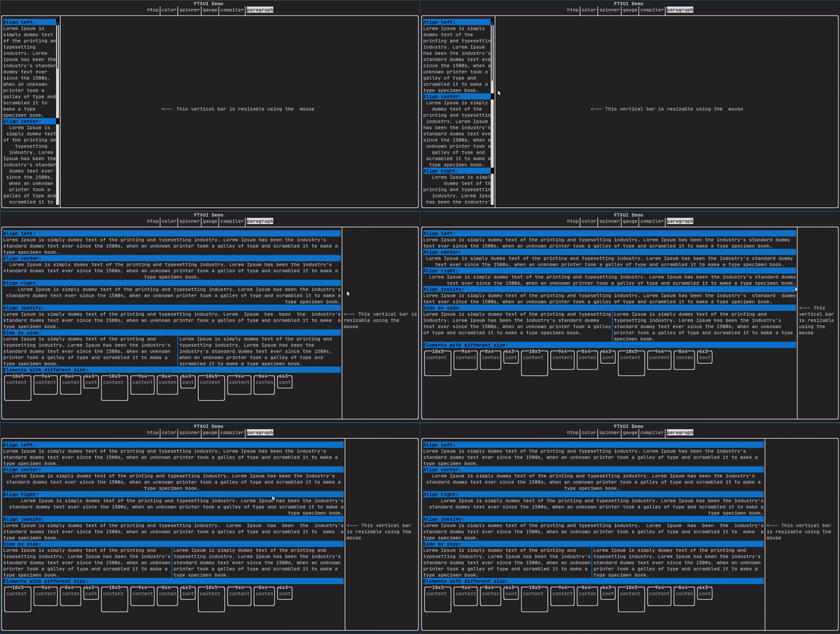
より詳細な例については、詳細な例を参照してください。Paragraphには、以下に示す他のバリアントも含まれています。
border
要素の周りに枠線を追加します。
コード:
border(text("The element"))
ターミナルの出力:
┌───────────┐
│The element│
└───────────┘
- Note
- パイプ演算子を使用しても同じ動作を実現できます。
コード: text("The element") | border
Borderには、以下に示すさまざまなスタイルもあります。
window
ftxui::windowはftxui::borderですが、追加のヘッダーがあります。要素の周囲にウィンドウを追加するには、それをラップし、ヘッダーとして文字列を指定します。 コード:
window("The window", text("The element"))
ターミナルの出力:
┌The window─┐
│The element│
└───────────┘
separator
コンテナの内容を視覚的に2つに分割するために、垂直/水平の線を 表示します。
コード:
border(
hbox({
text("Left"),
separator(),
text("Right")
})
)
ターミナルの出力:
┌────┬─────┐
│left│right│
└────┴─────┘
Separatorsには、以下に示すさまざまなフレーバーがあります。
Element separatorCharacter(std::string);
Color background,
Color foreground);
Color background,
Color foreground);
}
gauge
これは進捗の割合を表す視覚要素です。
コード:
ターミナルの出力:
┌────────────────────────────────────────────────────────────────────────────┐
│██████████████████████████████████████ │
└────────────────────────────────────────────────────────────────────────────┘
ゲージは以下に示すように様々な向きで表示できます:
namespace {
Element gauge(float ratio);
Element gaugeLeft(float ratio);
Element gaugeRight(float ratio);
Element gaugeUp(float ratio);
Element gaugeDown(float ratio);
Element gaugeDirection(float ratio, GaugeDirection);
}
graph
参照:
Element graph(GraphFunction);
色
ほとんどのターミナルコンソールは、色付きのテキストと色付きの背景を表示できます。FTXUIはすべてのカラーパレットをサポートしています。
Decorator color(Color);
Decorator bgcolor(Color);
カラーギャラリー: 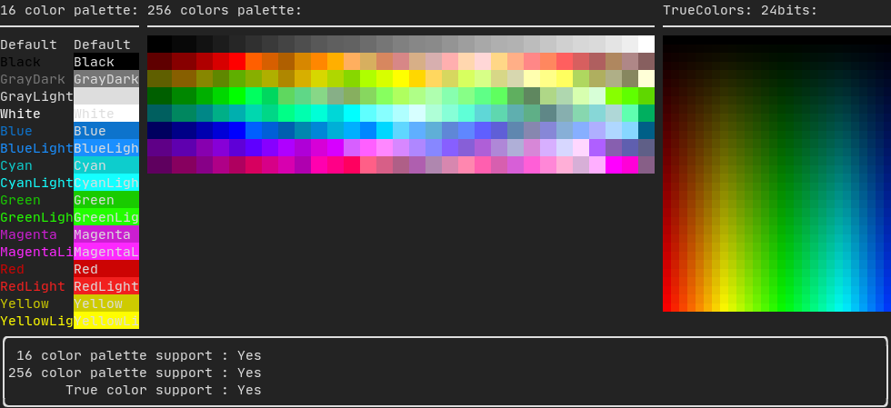
Palette16
ほとんどのターミナルでは、以下の色がサポートされています。
- Default
- Black
- GrayDark
- GrayLight
- White
- Blue
- BlueLight
- Cyan
- CyanLight
- Green
- GreenLight
- Magenta
- MagentaLight
- Red
- RedLight
- Yellow
- YellowLight
パイプ演算子を使った上記の色の使用例:
text("Blue foreground") | color(Color::Blue);
text("Blue background") | bgcolor(Color::Blue);
text("Black on white") | color(Color::Black) | bgcolor(Color::White);
Palette256
256色をサポートするターミナルで。
text("HotPink") | color(Color::HotPink);
トゥルーカラー
TrueColorをサポートするターミナルでは、24ビットRGB色空間を直接使用できます。
以下のコンストラクタを使用して、色の**RGB**または**HSV**値を指定します。
コンストラクタは2つあります:
ftxui::Color::RGB(uint8_t red, uint8_t green, uint8_t blue);
ftxui::Color::HSV(uint8_t hue, uint8_t saturation, uint8_t value);
線形グラデーション
FTXUIは線形グラデーションをサポートしています。前景または背景のいずれかです。
Decorator color(const LinearGradient&);
Decorator bgcolor(const LinearGradient&);
ftxui::LinearGradientは、角度(度数)と色の停止点のリストによって定義されます。
auto gradient = LinearGradient()
.Angle(45)
.AddStop(0.0, Color::Red)
.AddStop(0.5, Color::Green)
.AddStop(1.0, Color::Blue);
簡略化されたコンストラクタも使用できます:
LinearGradient(Color::Red, Color::Blue);
LinearGradient(45, Color::Red, Color::Blue);
デモを参照してください。
Style
色付きのテキストと色付きの背景に加えて、多くのターミナルはbold、italic、dim、underlined、inverted、blinkなどのテキスト効果をサポートしています。
Element bold(Element);
Element italic(Element);
Element dim(Element);
Element inverted(Element);
Element underlined(Element);
Element underlinedDouble(Element);
Element strikethrough(Element);
Element blink(Element);
Decorator color(Color);
Decorator bgcolor(Color);
Decorator colorgrad(LinearGradient);
Decorator bgcolorgrad(LinearGradient);
例

これらの効果を使用するには、要素を目的の効果でラップするだけです:
underlined(bold(text("This text is bold and underlined")))
あるいは、パイプ演算子を使って要素にチェーンすることもできます:
text("This text is bold") | bold | underlined
レイアウト
要素を次の方法で配置できます。
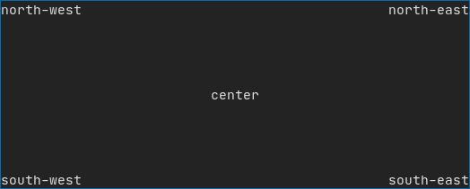
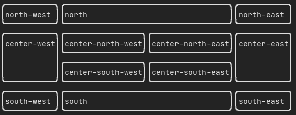
ftxui::hboxで**水平に**ftxui::vboxで**垂直に**ftxui::gridboxで**グリッド内に**ftxui::flexboxを使用して**一方向に折り返し**
ftxui::hbox、ftxui::vbox、ftxui::fillerを使用した例。
ftxui::gridboxを使用した例。
flexboxを使用した例。
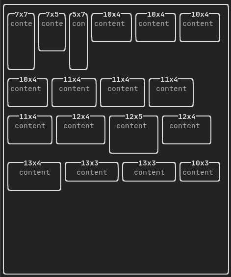
この例と関連するデモを確認してください。
要素はftxui::flexデコレータを使用して柔軟にすることもできます。
コード:
hbox({
text("left") | border ,
text("middle") | border | flex,
text("right") | border,
});
ターミナルの出力:
┌────┐┌─────────────────────────────────────────────────────┐┌─────┐
│left││middle ││right│
└────┘└─────────────────────────────────────────────────────┘└─────┘
コード:
hbox({
text("left") | border ,
text("middle") | border | flex,
text("right") | border | flex,
});
ターミナルの出力:
┌────┐┌───────────────────────────────┐┌───────────────────────────────┐
│left││middle ││right │
└────┘└───────────────────────────────┘└───────────────────────────────┘
テーブル
データを整然としたテーブル形式に簡単に整形できます。
基本的な例:
auto table = Table({
{"Planet", "Radius", "Mass"},
{"Mercury", "2440", "0.330"},
{"Venus", "6052", "4.87"},
{"Earth", "6371", "5.97"},
{"Mars", "3390", "0.642"},
});
table.SelectAll().Border(LIGHT);
table.SelectRow(0).Decorate(bold);
table.SelectRow(0).SeparatorVertical(LIGHT);
table.SelectRow(0).Border(DOUBLE);
auto document = table.Render();
コード例:
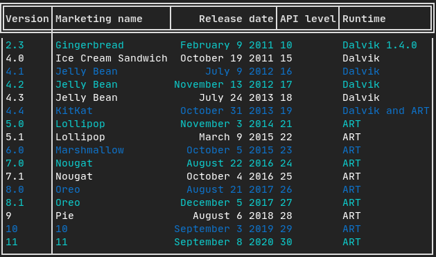
選択とスタイリング
テーブルの一部を選択し、デコレーターや枠線を適用できます。選択方法には以下が含まれます:
ftxui::TableSelection::SelectAll();
ftxui::TableSelection::SelectCell(column, row);
ftxui::TableSelection::SelectRow(row_index);
ftxui::TableSelection::SelectRows(row_min, row_max);
ftxui::TableSelection::SelectColumn(column_index);
ftxui::TableSelection::SelectColumns(column_min, column_max);
ftxui::TableSelection::SelectRectangle(column_min, column_max, row_min, row_max);
選択が行われたら、以下を適用できます:
ftxui::TableSelection::Decorate(Decorator);
ftxui::TableSelection::DecorateCells(Decorator);
ftxui::TableSelection::Border(BorderStyle);
ftxui::TableSelection::Separator(BorderStyle);
色付きの枠線
枠線や区切り線にのみ特化してデコレーターを適用することもできます:
table.SelectAll().Border(LIGHT, color(Color::Red));
table.SelectRow(0).SeparatorVertical(LIGHT, color(Color::Blue));
枠線を細かく装飾するために、以下のメソッドが利用可能です:
ftxui::TableSelection::DecorateBorder(Decorator);
ftxui::TableSelection::DecorateBorderLeft(Decorator);
ftxui::TableSelection::DecorateBorderRight(Decorator);
ftxui::TableSelection::DecorateBorderTop(Decorator);
ftxui::TableSelection::DecorateBorderBottom(Decorator);
ftxui::TableSelection::DecorateSeparator(Decorator);
ftxui::TableSelection::DecorateSeparatorVertical(Decorator);
ftxui::TableSelection::DecorateSeparatorHorizontal(Decorator);
キャンバス
API <ftxui/dom/canvas.hpp>を参照してください。
auto c = Canvas(100, 100);
c.DrawPointLine(10, 10, 80, 10, Color::Red);
auto element = canvas(c);
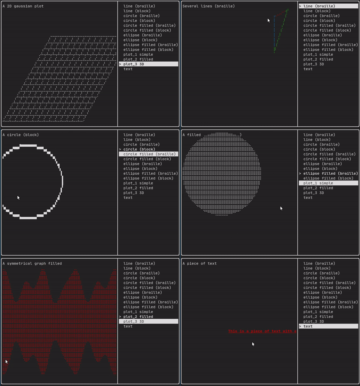
描画はftxui::Canvasで、点字、ブロック、または単純な文字を使用して実行できます。
単純な例:
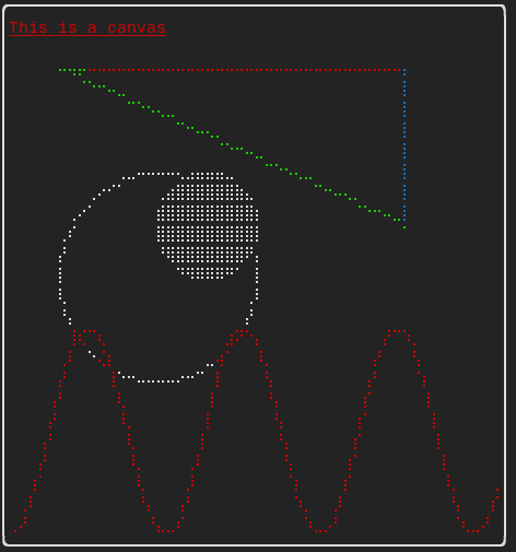
複雑な例: