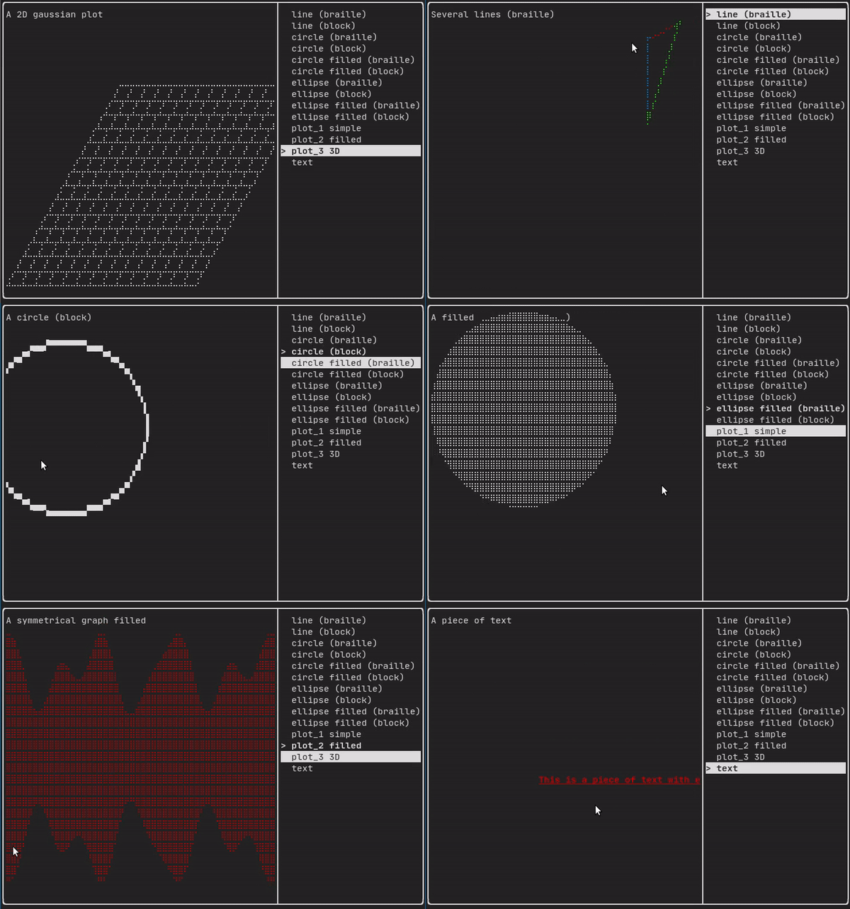
此模組定義了一組分層的 ftxui::Element。元素管理佈局,並能響應終端尺寸的變化。請注意以下範例,其中此模組用於創建一個帶有多個操作符的簡單佈局:
Example 部分提供了一系列範例。
範例:
...
Element document =
vbox({
text(
"The window") | bold |
color(Color::Blue),
text("The footer")
});
document = border(document);
document = document | border.
document |= border
...
}
Element text(std::string_view text)
顯示一段 UTF8 編碼的 Unicode 文字。
Element color(Color color, Element child)
設定元素的前景顏色。
Element gauge(float progress)
繪製一個高解析度進度條。
Element vbox(Elements children)
一個垂直一個接一個顯示元素的容器。
元素清單
所有元素的清單都已包含,並可透過包含 對應的標頭檔來存取:
#ifndef FTXUI_DOM_ELEMENTS_HPP
#define FTXUI_DOM_ELEMENTS_HPP
#include <cstdint>
#include <functional>
#include <memory>
#include <string_view>
class Node;
using Element = std::shared_ptr<Node>;
};
Color unselected_color,
Color selected_color);
Color unselected_color,
Color selected_color);
std::vector<std::string> charset,
Element canvas(
int width,
int height, std::function<
void(Canvas&)>);
}
}
#include "ftxui/dom/take_any_args.hpp"
#endif
#define FTXUI_EXPORT(component)
Element window(Element title, Element content, BorderStyle border=ROUNDED)
繪製帶有標題和邊框的視窗。
Element borderDouble(Element child)
在元素周圍繪製雙線邊框。
Element focusCursorBarBlinking(Element child)
與 focus 相同,但將游標形狀設置為閃爍條狀。
Element xflex(Element)
在 X 軸上盡可能擴展/在需要時最小化。
Element gaugeDirection(float progress, Direction direction)
繪製一個指定方向的高解析度進度條。
Decorator focusPositionRelative(float x, float y)
在 frame 內部使用,這會強制視圖滾動到給定位置。該位置以請求大小的比例表示。
Element separatorStyled(BorderStyle style)
在兩個元素之間繪製垂直或水平分隔線。
Element xflex_grow(Element)
在 X 軸上盡可能擴展。
Element underlinedDouble(Element child)
對文字應用雙底線。
Element clear_under(Element element)
在繪製 |child| 之前,先清除底下的儲存格。這在 搭配 dbox 使用時很有用。
Element borderDashed(Element child)
在元素周圍繪製虛線邊框。
Element separatorEmpty()
使用 EMPTY 樣式在兩個元素之間繪製垂直或水平分隔線。
Element vscroll_indicator(Element child)
在右側顯示一個垂直捲軸。 顏色與內容一致。
Element nothing(Element element)
一個什麼都不做的裝飾器。
Element paragraphAlignLeft(std::string_view the_text)
回傳一個在多行上繪製段落並靠左對齊的元素。
Decorator size(WidthOrHeight direction, Constraint constraint, int value)
對元素的大小套用限制。
Element flex(Element child)
讓子元素依比例擴展以填滿容器中剩餘的空間。
Element hyperlink(std::string_view link, Element child)
使渲染區域可點擊並使用網路瀏覽器開啟。 當用戶點擊時,連結將被開啟。 此功能僅在有限的終端模擬器中受支援。 List: https://github.com/Alhadis/OSC8-Adoption/
Element gaugeRight(float progress)
繪製一個從左到右進展的高解析度進度條。
Element focusCursorUnderlineBlinking(Element child)
與 focus 相同,但將游標形狀設置為閃爍底線。
Element bold(Element child)
使用粗體字型,用於需要更多強調的元素。
Element separatorLight()
使用 LIGHT 樣式在兩個元素之間繪製垂直或水平分隔線。
Element spinner(int charset_index, size_t image_index)
用於表示時間和/或事件的效果。這將顯示 一個 ASCII 藝術「影片」。
Element borderRounded(Element child)
在元素周圍繪製圓角邊框。
Element yflex(Element)
在 Y 軸上盡可能擴展/在需要時最小化。
Element flex_shrink(Element child)
在需要時最小化。
Element focusCursorBar(Element child)
與 focus 相同,但將游標形狀設置為靜止條狀。
Element focusCursorBlock(Element child)
與 focus 相同,但將游標形狀設置為靜止條狀。
Element vtext(std::string_view text)
垂直顯示一段 Unicode 文字。
BorderStyle
BorderStyle 是一個列舉,表示可以應用於終端機 UI 元素的不同邊框樣式。
Element underlined(Element child)
為給定元素加上底線。
Element center(Element child)
水平與垂直置中一個元素。
Element paragraphAlignJustify(std::string_view the_text)
回傳一個在多行上繪製段落並使用左右對齊的元素。
Direction
Direction 是一個列舉,表示四個主要方向。
Element focusCursorUnderline(Element child)
與 focus 相同,但將游標形狀設置為靜止底線。
Element borderHeavy(Element child)
在元素周圍繪製粗邊框。
Element inverted(Element child)
添加一個濾鏡,它將反轉前景和背景 顏色。
Element gaugeUp(float progress)
繪製一個從下到上進展的高解析度進度條。
Element gaugeCharset(float progress, std::vector< std::string > charset, Direction direction=Direction::Right)
使用自訂字元集繪製高解析度進度條。
Element align_right(Element child)
將元素靠右對齊。
Decorator focusPosition(int x, int y)
在 frame 內部使用,這會強制視圖滾動到給定位置。該位置以單元格數表示。
Element yflex_grow(Element)
在 Y 軸上盡可能擴展。
Element hscroll_indicator(Element child)
在底部顯示一個水平捲軸。 顏色與內容一致。
Element flex_grow(Element child)
盡可能擴展。
Element separatorDashed()
使用 DASHED 樣式在兩個元素之間繪製垂直或水平分隔線。
Element notflex(Element child)
使元素不可伸縮。
Element strikethrough(Element child)
對文字應用刪除線。
Element italic(Element child)
對文字應用雙底線。
Element dbox(Elements children_)
將多個元素堆疊在一起。
Element xflex_shrink(Element)
在 X 軸上在需要時最小化。
Decorator borderWith(const Cell &pixel)
與 border 相同,但周圍使用固定的 Cell。
Element gaugeLeft(float progress)
繪製一個從右到左進展的高解析度進度條。
Element paragraphAlignCenter(std::string_view the_text)
回傳一個在多行上繪製段落並置中對齊的元素。
Element borderLight(Element child)
在元素周圍繪製細邊框。
Element focus(Element child)
將 child 設置為其同級元素中被聚焦的元素。
Element paragraph(std::string_view the_text)
回傳一個在多行上繪製段落的元素。
Element bgcolor(Color color, Element child)
設定元素的背景顏色。
Decorator borderStyled(BorderStyle style)
與 border 相同,但具有不同的樣式。
Element paragraphAlignRight(std::string_view the_text)
回傳一個在多行上繪製段落並靠右對齊的元素。
Element separator()
在兩個元素之間繪製垂直或水平分隔線。
Element filler()
一個會依照容器中剩餘空間 按比例擴展的元素。
Element dim(Element child)
使用淺色字體,適用於不那麼強調的元素。
Element automerge(Element child)
啟用字符自動與附近其他字符合併。
Element separatorCharacter(std::string_view value)
在兩個元素之間繪製垂直或水平分隔線。
Element blink(Element child)
繪製的文字在可見和隱藏之間交替。
Element vcenter(Element child)
垂直置中一個元素。
Element separatorDouble()
使用 DOUBLE 樣式在兩個元素之間繪製垂直或水平分隔線。
Element focusCursorBlockBlinking(Element child)
與 focus 相同,但將游標形狀設置為閃爍方塊。
Element border(Element child)
在元素周圍繪製邊框。
Element separatorHeavy()
使用 HEAVY 樣式在兩個元素之間繪製垂直或水平分隔線。
Element borderEmpty(Element child)
在元素周圍繪製空邊框。
Element yflex_shrink(Element)
在 Y 軸上在需要時最小化。
Element hcenter(Element child)
水平置中一個元素。
Element gaugeDown(float progress)
繪製一個從上到下進展的高解析度進度條。
FTXUI 的 ftxui::Dimension:: 命名空間
bool extend_beyond_screen
Element flexbox(Elements, FlexboxConfig config=FlexboxConfig())
一個容器,用於在行/列中顯示元素,並在滿時能夠換行到下一列/行。
Element separatorVSelector(float up, float down, Color unselected_color, Color selected_color)
繪製一個垂直條,其中上方/下方之間的區域以不同顏色顯示。
Decorator yflex_shrink_factor(int shrink)
std::shared_ptr< Node > Element
Element xframe(Element child)
與 frame 相同,但僅限於 x 軸。
Decorator xflex_grow_factor(int grow)
FTXUI_EXPORT(DOM) Element gridbox(std Element hflow(Elements)
一個容器,用於從左到右在行中顯示元素。當填滿時,它會在下方的新行開始。
Decorator yflex_grow_factor(int grow)
FTXUI_EXPORT(DOM) Element separatorCharacter(std Element separatorHSelector(float left, float right, Color unselected_color, Color selected_color)
繪製一個水平條,其中左右兩側之間的區域以不同顏色顯示。
Element hbox(Elements children)
一個逐一水平顯示元素的容器。
std::vector< Element > Elements
Decorator selectionForegroundColor(Color foreground)
設定元素被選取時的前景顏色。 請注意,此樣式會應用在現有樣式之上。
Decorator yflex_factor(int grow, int shrink)
Component operator|(Component component, ComponentDecorator decorator)
Decorator selectionBackgroundColor(Color foreground)
設定元素被選取時的背景顏色。 請注意,此樣式會應用在現有樣式之上。
std::function< Element(Element)> Decorator
Decorator flex_shrink_factor(int shrink)
Element yframe(Element child)
與 frame 相同,但僅限於 y 軸。
Decorator flex_grow_factor(int grow)
Decorator selectionColor(Color foreground)
設定元素被選取時的顏色。
Element selectionStyleReset(Element child)
重設元素的選取樣式。
Decorator reflect(Box &box)
std::function< std::vector< int >(int, int)> GraphFunction
Decorator xflex_shrink_factor(int shrink)
Decorator xflex_factor(int grow, int shrink)
Decorator flex_factor(int grow, int shrink)
Element gridbox(std::vector< Elements > lines)
A container displaying a grid of elements.
Element canvas(int width, int height, std::function< void(Canvas &)>)
從指定大小的畫布中產生一個繪製畫布的元素。
Element frame(Element child)
允許元素顯示在「虛擬」區域內。其大小可以大於其容器。在這種情況下,只會顯示較小的一部分。視圖可滾動以使聚焦元素可見。
Component & operator|=(Component &component, ComponentDecorator decorator)
Element select(Element e)
將 child 設為其兄弟元素中被聚焦的那一個。
Decorator selectionStyle(std::function< void(Cell &)> style)
設定元素被選取時的樣式。
Element vflow(Elements)
一個容器,用於從上到下在行中顯示元素。當填滿時,它會在右側的新列開始。 filled, it starts on a new row. is full, it starts a new row.
Element graph(GraphFunction graph_function)
使用 GraphFunction 繪製圖形。
text
最簡單的元件。它顯示一段文字。
text("I am a piece of text");
vtext
與 ftxui::text 相同,但垂直顯示。
程式碼:
終端機輸出:
paragraph
類似於 ftxui::text,但單詞會根據其容器的寬度自動換行到多行。
範例程式碼:
paragraph("A very long text")
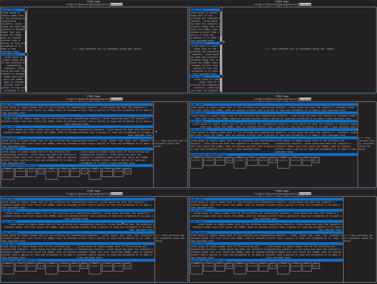
有關更詳細的範例,請參閱 詳細範例。Paragraph 還包括以下所示的其他變體:
border
在元素周圍加上邊框。
程式碼:
border(text("The element"))
終端機輸出:
┌───────────┐
│The element│
└───────────┘
- Note
- 您可以使用 pipe 運算符實現相同的行為。
程式碼: text("The element") | border
Border 也支援多種樣式,如下所示:
window
ftxui::window 是一個 ftxui::border,但帶有額外的標頭。要為元素添加視窗,請將其包裹並指定一個字串作為標頭。 程式碼:
window("The window", text("The element"))
終端機輸出:
┌The window─┐
│The element│
└───────────┘
separator
顯示一條垂直/水平線,以在視覺上將容器的內容 分成兩部分。
程式碼:
border(
hbox({
text("Left"),
separator(),
text("Right")
})
)
終端機輸出:
┌────┬─────┐
│left│right│
└────┴─────┘
分隔線有多種樣式,如下所示:
Color background,
Color foreground);
Color background,
Color foreground);
}
gauge
這是一個表示進度比例的視覺元素。
程式碼:
終端機輸出:
┌────────────────────────────────────────────────────────────────────────────┐
│██████████████████████████████████████ │
└────────────────────────────────────────────────────────────────────────────┘
量表(gauge)可以以多種方向顯示,如下所示:
namespace {
Element gauge(float ratio);
Element gaugeLeft(float ratio);
Element gaugeRight(float ratio);
Element gaugeUp(float ratio);
Element gaugeDown(float ratio);
Element gaugeDirection(float ratio, GaugeDirection);
}
graph
另見:
Element graph(GraphFunction);
顏色
大多數終端控制台都可以顯示彩色文本和彩色背景。FTXUI 支援所有調色板:
Decorator color(Color);
Decorator bgcolor(Color);
顏色 圖庫: 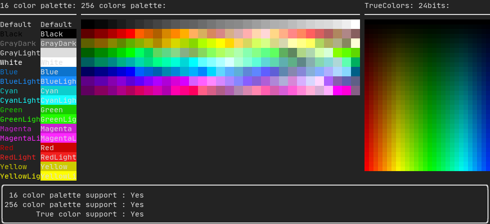
16色調色板
大多數終端都支援以下顏色:
- Default
- Black
- GrayDark
- GrayLight
- White
- Blue
- BlueLight
- Cyan
- CyanLight
- Green
- GreenLight
- Magenta
- MagentaLight
- Red
- RedLight
- Yellow
- YellowLight
使用管線運算子(pipe operator)搭配上述顏色的範例:
text("Blue foreground") | color(Color::Blue);
text("Blue background") | bgcolor(Color::Blue);
text("Black on white") | color(Color::Black) | bgcolor(Color::White);
256色調色板
在支援 256 種顏色的終端上。
text("HotPink") | color(Color::HotPink);
TrueColor (真彩色)
在支援 TrueColor 的終端上,您可以直接使用 24 位 RGB 顏色空間:
使用以下構造函數來指定顏色的 RGB 或 HSV 值:
有兩種建構子:
ftxui::Color::RGB(uint8_t red, uint8_t green, uint8_t blue);
ftxui::Color::HSV(uint8_t hue, uint8_t saturation, uint8_t value);
線性漸層
FTXUI 支援線性漸層。無論是在前景還是背景上。
Decorator color(const LinearGradient&);
Decorator bgcolor(const LinearGradient&);
ftxui::LinearGradient 由角度(以度為單位)和顏色停止點列表定義。
auto gradient = LinearGradient()
.Angle(45)
.AddStop(0.0, Color::Red)
.AddStop(0.5, Color::Green)
.AddStop(1.0, Color::Blue);
你也可以使用簡化的建構子:
LinearGradient(Color::Red, Color::Blue);
LinearGradient(45, Color::Red, Color::Blue);
見 demo。
樣式
除了彩色文本和彩色背景之外。許多終端還支援文本效果,例如:bold(粗體)、italic(斜體)、dim(變暗)、underlined(底線)、inverted(反轉)、blink(閃爍)。
Element bold(Element);
Element italic(Element);
Element dim(Element);
Element inverted(Element);
Element underlined(Element);
Element underlinedDouble(Element);
Element strikethrough(Element);
Element blink(Element);
Decorator color(Color);
Decorator bgcolor(Color);
Decorator colorgrad(LinearGradient);
Decorator bgcolorgrad(LinearGradient);
範例

要使用這些效果,只需將你的元素以想要的效果包裝:
underlined(bold(text("This text is bold and underlined")))
或者,使用 pipe 運算符將其鏈接到您的元素上:
text("This text is bold") | bold | underlined
佈局
使元素可以透過以下方式排列:
- 水平 使用
ftxui::hbox
- 垂直 使用
ftxui::vbox
- 在網格內部 使用
ftxui::gridbox
- 沿一個方向換行 使用
ftxui::flexbox。
使用 ftxui::hbox、ftxui::vbox 與 ftxui::filler 的範例。
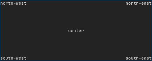
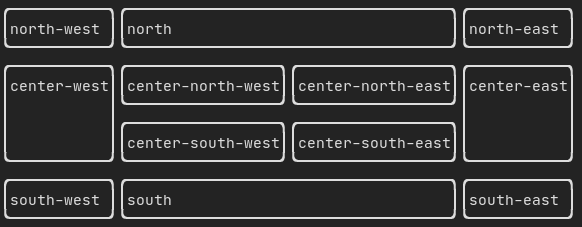
使用 ftxui::gridbox 的範例:
使用 flexbox 的範例:
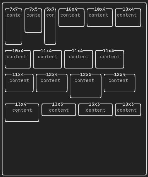
查看此 範例 以及相關的 demo。
元素也可以使用 ftxui::flex 裝飾器變得靈活。
程式碼:
hbox({
text("left") | border ,
text("middle") | border | flex,
text("right") | border,
});
終端機輸出:
┌────┐┌─────────────────────────────────────────────────────┐┌─────┐
│left││middle ││right│
└────┘└─────────────────────────────────────────────────────┘└─────┘
程式碼:
hbox({
text("left") | border ,
text("middle") | border | flex,
text("right") | border | flex,
});
終端機輸出:
┌────┐┌───────────────────────────────┐┌───────────────────────────────┐
│left││middle ││right │
└────┘└───────────────────────────────┘└───────────────────────────────┘
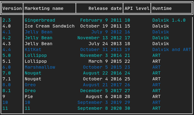
表格
讓你可以輕鬆地將資料格式化成整齊的表格視覺形式。
基本範例:
auto table = Table({
{"Planet", "Radius", "Mass"},
{"Mercury", "2440", "0.330"},
{"Venus", "6052", "4.87"},
{"Earth", "6371", "5.97"},
{"Mars", "3390", "0.642"},
});
table.SelectAll().Border(LIGHT);
table.SelectRow(0).Decorate(bold);
table.SelectRow(0).SeparatorVertical(LIGHT);
table.SelectRow(0).Border(DOUBLE);
auto document = table.Render();
程式碼範例:
選取與樣式設定
你可以選取表格的部分內容,並套用裝飾器或邊框到它們身上。選取方法包括:
ftxui::TableSelection::SelectAll();
ftxui::TableSelection::SelectCell(column, row);
ftxui::TableSelection::SelectRow(row_index);
ftxui::TableSelection::SelectRows(row_min, row_max);
ftxui::TableSelection::SelectColumn(column_index);
ftxui::TableSelection::SelectColumns(column_min, column_max);
ftxui::TableSelection::SelectRectangle(column_min, column_max, row_min, row_max);
完成選取之後,你可以套用:
ftxui::TableSelection::Decorate(Decorator);
ftxui::TableSelection::DecorateCells(Decorator);
ftxui::TableSelection::Border(BorderStyle);
ftxui::TableSelection::Separator(BorderStyle);
有顏色的邊框
你也可以將裝飾器專門套用於邊框與分隔線:
table.SelectAll().Border(LIGHT, color(Color::Red));
table.SelectRow(0).SeparatorVertical(LIGHT, color(Color::Blue));
以下方法可用於細緻的邊框裝飾:
ftxui::TableSelection::DecorateBorder(Decorator);
ftxui::TableSelection::DecorateBorderLeft(Decorator);
ftxui::TableSelection::DecorateBorderRight(Decorator);
ftxui::TableSelection::DecorateBorderTop(Decorator);
ftxui::TableSelection::DecorateBorderBottom(Decorator);
ftxui::TableSelection::DecorateSeparator(Decorator);
ftxui::TableSelection::DecorateSeparatorVertical(Decorator);
ftxui::TableSelection::DecorateSeparatorHorizontal(Decorator);
畫布
詳見 API <ftxui/dom/canvas.hpp>
auto c = Canvas(100, 100);
c.DrawPointLine(10, 10, 80, 10, Color::Red);
auto element = canvas(c);
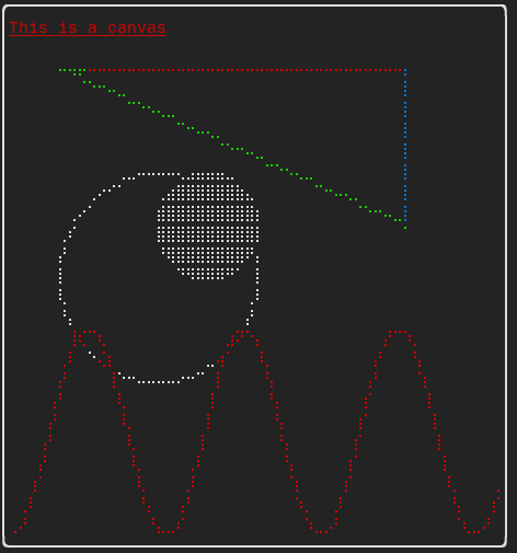
繪圖可以在 ftxui::Canvas 上執行,使用盲文、區塊或簡單字元:
簡單的 範例:
複雜的範例: