
ftxui::component 模組定義了生成互動元件的邏輯,這些元件響應使用者事件(鍵盤、滑鼠等)。
Example 章節提供了一系列範例。
ftxui::App 定義了一個渲染元件的主迴圈。
ftxui::Component 是 ftxui::ComponentBase 的共享指針。後者定義了:
ftxui::ComponentBase::Render(): 如何渲染介面。ftxui::ComponentBase::OnEvent(): 如何響應事件。ftxui::ComponentBase::Add(): 在兩個元件之間建立父/子關係。元件樹用於定義如何使用鍵盤導航。
ftxui::Element 用於渲染單個畫面。
ftxui::Component 用於渲染動態使用者介面,生成多個畫面,並在事件發生時更新其狀態。
畫廊 多個元件的集合。 (demo)
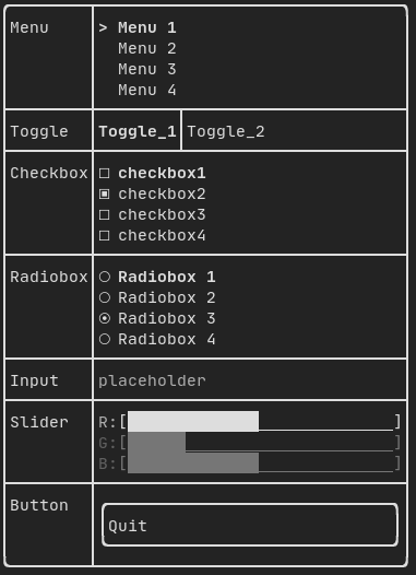
所有預定義的元件都可以在 "ftxui/dom/component.hpp" 中找到。
#ifndef FTXUI_COMPONENT_HPP
#define FTXUI_COMPONENT_HPP
#include <functional>
#include <memory>
#include <utility>
struct ButtonOption;
struct CheckboxOption;
struct Event;
struct InputOption;
struct MenuOption;
struct RadioboxOption;
struct MenuEntryOption;
template <class T, class... Args>
std::shared_ptr<T>
Make(Args&&... args) {
return std::make_shared<T>(std::forward<Args>(args)...);
}
}
std::function<void()> on_click,
ButtonOption options = ButtonOption::Simple());
bool* checked,
CheckboxOption options = CheckboxOption::Simple());
StringRef placeholder,
InputOption options = {});
int* selected_,
MenuOption options = MenuOption::Vertical());
int* selected_,
RadioboxOption options = {});
template <typename T>
Slider(SliderOption<uint16_t>);
Slider(SliderOption<uint32_t>);
Slider(SliderOption<uint64_t>);
ConstRef<int> min = 0,
ConstRef<int> max = 100,
ConstRef<int> increment = 5);
ConstRef<float> min = 0.f,
ConstRef<float> max = 100.f,
ConstRef<float> increment = 5.f);
ConstRef<long> min = 0L,
ConstRef<long> max = 100L,
ConstRef<long> increment = 5L);
std::function<void()> on_enter,
std::function<void()> on_leave);
std::function<void(bool)> on_change);
std::function<void()> on_leave);
}
#endif
#define FTXUI_EXPORT(component)
Component Button(ConstStringRef label, std::function< void()> on_click, ButtonOption options=ButtonOption::Simple())
繪製一個按鈕。點擊時執行一個函式。
Component ResizableSplitTop(Component main, Component back, int *main_size)
兩個元件之間的垂直分割,可透過 滑鼠調整大小。
Component Horizontal(Components children, int *selector)
一個元件列表,水平地一個接一個繪製,並使用左/右箭頭鍵或 'h'/'l' 鍵進行水平導航。
Component Toggle(ConstStringListRef entries, int *selected)
元素的水平列表。使用者可以在其中導航。
FTXUI_EXPORT(COMPONENT) ComponentDecorator Maybe(std Component Modal(Component main, Component modal, const bool *show_modal)
Component Renderer(Component child, std::function< Element()>)
回傳一個新的 Component,類似 |child|,但使用 |render| 作為 Component::Render() 事件。
Component Hoverable(Component component, bool *hover)
包裝一個元件。提供能力以判斷滑鼠是否懸停在其上方。
Component Checkbox(ConstStringRef label, bool *checked, CheckboxOption options=CheckboxOption::Simple())
繪製可勾選的元素。
Component Window(WindowOptions option)
一個可拖曳/可調整大小的視窗。要使用多個視窗,它們必須透過 Container::Stacked({...}) 元件堆疊。
Component Vertical(Components children)
一個元件列表,垂直地一個接一個繪製,並使用上/下箭頭鍵或 'j'/'k' 鍵進行垂直導航。
Component Maybe(Component child, std::function< bool()> show)
裝飾一個組件 |child|。它只在 |show| 返回 true 時顯示。
Component ResizableSplitRight(Component main, Component back, int *main_size)
兩個元件之間的水平分割,可透過 滑鼠調整大小。
Component Input(StringRef content, InputOption options={})
用於編輯文字的輸入框。
Component Dropdown(ConstStringListRef entries, int *selected)
下拉式選單。
Component Stacked(Components children)
一個元件列表,將彼此堆疊。 事件會傳播到第一個元件,如果未處理則傳播到第二個,依此類推。 元件以給定的相反順序繪製。 當一個元件獲得焦點時,它會被放到最前面,而不改變其他元素的相對順序。
Component Radiobox(ConstStringListRef entries, int *selected_, RadioboxOption options={})
一份元素清單,只能選取其中一個。
Component ResizableSplitBottom(Component main, Component back, int *main_size)
兩個元件之間的垂直分割,可透過 滑鼠調整大小。
Component Menu(ConstStringListRef entries, int *selected_, MenuOption options=MenuOption::Vertical())
一份文字清單。取得焦點的元素會被選取。
Component ResizableSplitLeft(Component main, Component back, int *main_size)
兩個元件之間的水平分割,可透過 滑鼠調整大小。
Component Tab(Components children, int *selector)
一個元件列表,一次只繪製一個並與之互動。|selector| 給出所選元件的索引。這對於實作分頁很有用。
Component MenuEntry(ConstStringRef label, MenuEntryOption options={})
一個特定的選單項目。可以將它們放入 Container::Vertical 以 組成一個選單。
FTXUI ftxui::Container:: 命名空間
std::shared_ptr< T > Make(Args &&... args)
std::shared_ptr< Node > Element
std::function< Element(Element)> ElementDecorator
std::vector< Component > Components
Component ResizableSplit(ResizableSplitOption options)
兩個元件之間的分隔。
Component operator|(Component component, ComponentDecorator decorator)
Component Collapsible(ConstStringRef label, Component child, Ref< bool > show=false)
可折疊元件。它顯示一個帶有箭頭的核取方塊。一旦啟用,子元件就會顯示。
Component Slider(SliderOption< T > options)
任意方向的滑桿。
Component & operator|=(Component &component, ComponentDecorator decorator)
std::function< Component(Component)> ComponentDecorator
std::shared_ptr< ComponentBase > Component
Component CatchEvent(Component child, std::function< bool(Event)>)
輸入
範例:
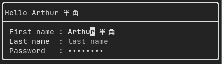
由 ftxui::Input() 從 "ftxui/component/component.hpp" 生成。
篩選輸入
可以使用 ftxui::CatchEvent 過濾輸入元件接收到的字元。
std::string phone_number;
Component input = Input(&phone_number, "phone number");
input |= CatchEvent([&](Event event) {
return event.is_character() && !std::isdigit(event.character()[0]);
});
input |= CatchEvent([&](Event event) {
return event.is_character() && phone_number.size() >= 10;
});
選單
定義一個選單物件。它包含一組項目清單,其中一個項目會被選中。
範例:

由 ftxui::Dropdown() 從 "ftxui/component/component.hpp" 生成。
表示一個滑塊物件,它由一個帶有分箱中間間隔的範圍組成。它可以使用 ftxui::Slider() 創建。
一種特殊的選單。項目會以水平方式顯示。
範例:

Renderer
CheckBox
此元件定義一個核取方塊。它是一個可以 開/關的單一項目。
範例:
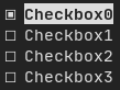
由以下產生:ftxui::Checkbox(),來自 "ftxui/component/component.hpp"
RadioBox
一個單選按鈕元件。這是一份項目清單,其中可以有一個被開啟。
範例:
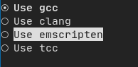
由以下產生:ftxui::Radiobox(),來自 "ftxui/component/component.hpp"
Dropdown
下拉式選單是一種元件,展開時會顯示一份項目清單 供使用者選擇。
範例:

由以下產生:ftxui::Dropdown(),來自 "ftxui/component/component.hpp"
Slider
表示一個滑桿物件,由一個範圍與分格的中間 區間所組成。可以透過 ftxui::Slider() 建立。
範例:
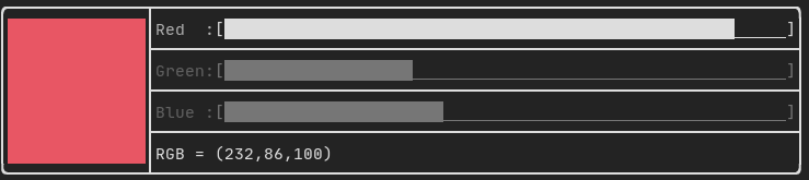
由以下產生:ftxui::Slider(),來自 "ftxui/component/component.hpp"
Renderer
由以下產生:ftxui::Renderer(),來自 ftxui/component/component.hpp。此 元件透過使用不同的函式來渲染介面,藉此 裝飾另一個元件。
範例:
auto inner = [...]
auto renderer = Renderer(inner, [&] {
return inner->Render() | border
});
ftxui::Renderer 也支援元件裝飾器模式:
auto component = [...]
component = component
| Renderer([](Element e) { return e | border))
| Renderer(bold)
作為簡便寫法,你也可以用元素裝飾器來組合元件:
auto component = [...]
component = component | border | bold;
CatchEvent
由 ftxui::CatchEvent() 從 ftxui/component/component.hpp 生成。此元件裝飾其他元件,在底層元件之前捕獲事件。
範例:
auto screen = App::TerminalOutput();
auto renderer = Renderer([] {
return text("My interface");
});
auto component = CatchEvent(renderer, [&](Event event) {
if (event == Event::Character('q')) {
screen.ExitLoopClosure()();
return true;
}
return false;
});
screen.Loop(component);
ftxui::CatchEvent 也可以用作裝飾器:
component = component
| CatchEvent(handler_1)
| CatchEvent(handler_2)
| CatchEvent(handler_3)
;
Collapsible
對於使用者可以開啟或關閉其可見性的視覺元素很有用。本質上,這是 ftxui::Checkbox() 和 ftxui::Maybe() 元件的組合。
auto collapsible = Collapsible("Show more", inner_element);
Maybe
由 ftxui::Maybe() 從 ftxui/component/component.hpp 生成。 此元件可用於通過布林值或謂詞顯示/隱藏任何其他元件。
使用布林值的範例:
bool show = true;
auto component = Renderer([]{ return "Hello World!"; });
auto maybe_component = Maybe(component, &show)
使用述詞(predicate)的範例:
auto component = Renderer([]{ return "Hello World!"; });
auto maybe_component = Maybe(component, [&] { return time > 10; })
像往常一樣,ftxui::Maybe 也可以用作裝飾器:
component = component
| Maybe(&a_boolean)
| Maybe([&] { return time > 10; })
;
Container
Horizontal
由 ftxui::Container::Horizontal() 從 "ftxui/component/component.hpp" 生成。它水平顯示元件列表並處理鍵盤/滑鼠導航。
Vertical
由 ftxui::Container::Vertical() 從 "ftxui/component/component.hpp" 生成。它垂直顯示元件列表並處理鍵盤/滑鼠導航。
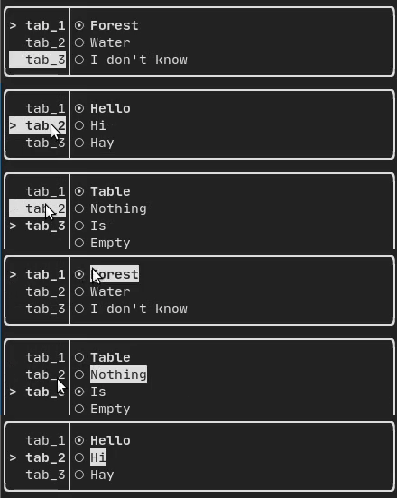
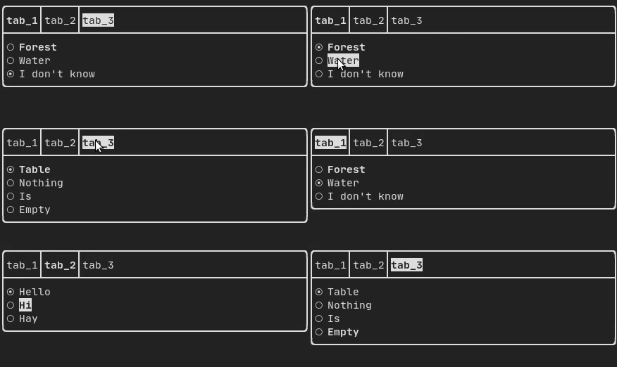
Tab
由 ftxui::Container::Tab() 從 "ftxui/component/component.hpp" 生成。它接受元件列表並僅顯示其中一個。這對於實現分頁欄很有用。
垂直:
水平:
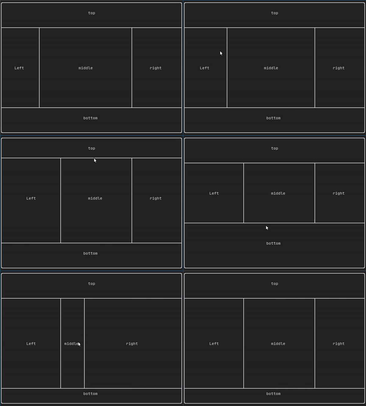
ResizableSplit
它定義了兩個子元件之間的水平或垂直分隔。分隔的位置是可變的,並且可以使用滑鼠控制。 有四種可能的分隔:
範例:
強制重新繪製畫面
通常,ftxui::App::Loop() 負責在每一群新的 事件(例如鍵盤、滑鼠、視窗大小調整等)被處理完後, 繪製一個新的畫面。然而,你可能想要回應 FTXUI 未知的任意事件。要達成這點,你必須透過 一個執行緒使用 ftxui::App::PostEvent(**這是執行緒安全的**) 來發布事件。你必須發布事件 ftxui::Event::Custom。
範例:
screen->PostEvent(Event::Custom);
如果你不需要處理新的 Event,可以改用:
screen->RequestAnimationFrame();
來代替。